MentaMorph Money App:
UX Case Study
An immersive financial simulation to teach financial literacy
MY ROLE: Lead UI Designer & UX Researcher | TOOLS: Figma, Adobe Photoshop, Adobe Illustrator | TIMELINE: 3 Weeks

CLIENT OVERVIEW
MentaMorph Money’s mission is to teach financial literacy to young adults aged 17-22. Based on a hand-programmed Excel game, MentaMorph Money is an immersive, engaging and educational simulation.
The ultimate goal is to have the highest net worth in the game while taking away valuable life lessons that players can be applied to their financial decision-making.
PROJECT GOAL
Our team was tasked with expanding and reimagining the existing game tutorial. The areas where our attention was focused were: the overall usability and UI of the app, development of the onboarding & tutorial, and the incorporation of education modules.

ABOVE: The Prototype and branding for MentaMorph Money before our team took over the project.
RESEARCH
To kick off the research phase, we began with two intense days of learning how the current game and prototype of MentaMorph Money worked. We read briefs that showed the existing research, including competitive analysis, branding, and game flows. These two days concluded with playing the original Excel version of the game with the CEO of MentaMorph. This meeting gave us a deep understanding of the product before we started further research areas.
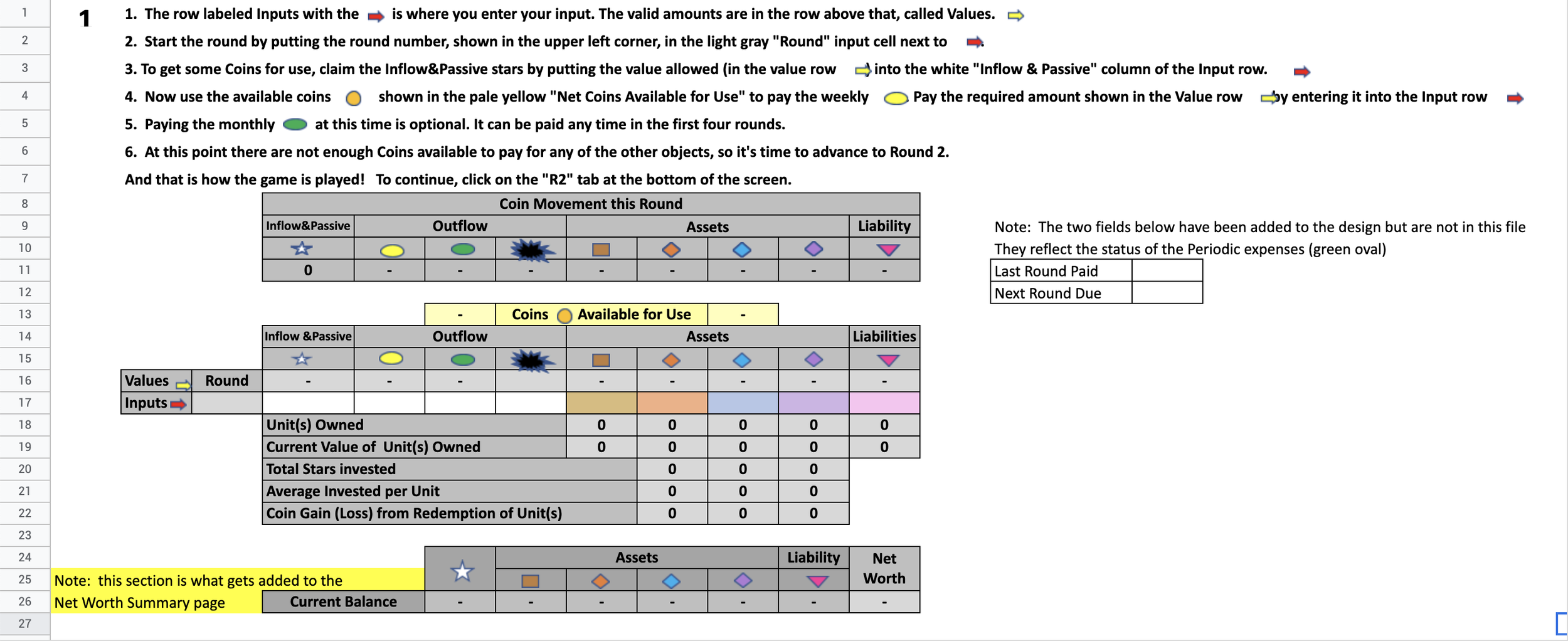
ABOVE: The original game of MentaMorph which is a 20 round Excel experience.
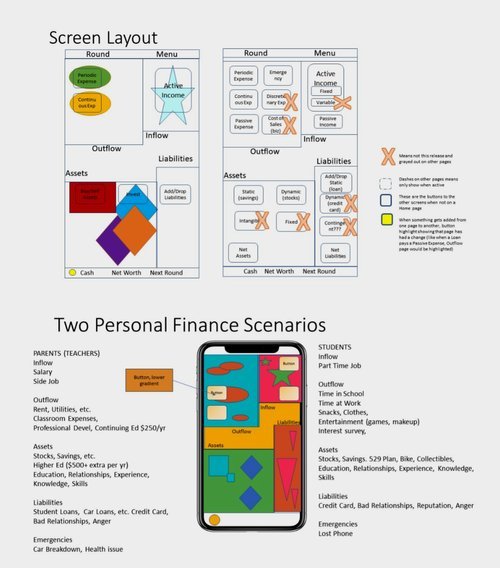
MentaMorph provided a number of screen analysis wireframes for us to study.
USER INTERVIEWS
KEY FINDINGS: our users were nearly unanimous in their evaluation that the tutorial experience was too long and didn’t adequately explain the financial concepts taught in the game.

There was a lot of consensus in our user interviews, making the condensed affinity map quite simple!
We began our research by conducting ten moderated user tests of the existing prototype to establish a baseline for our explorations. Our users were nearly unanimous in their evaluation that the tutorial experience was too long and didn’t adequately explain the relationship between the items collected and the correlated financial concepts.
My goal was to develop a problem statement that would address our client’s wishlist and allow our team to explore ways to improve the look of the onboarding experience based on the target market demographics (aged 17-22).
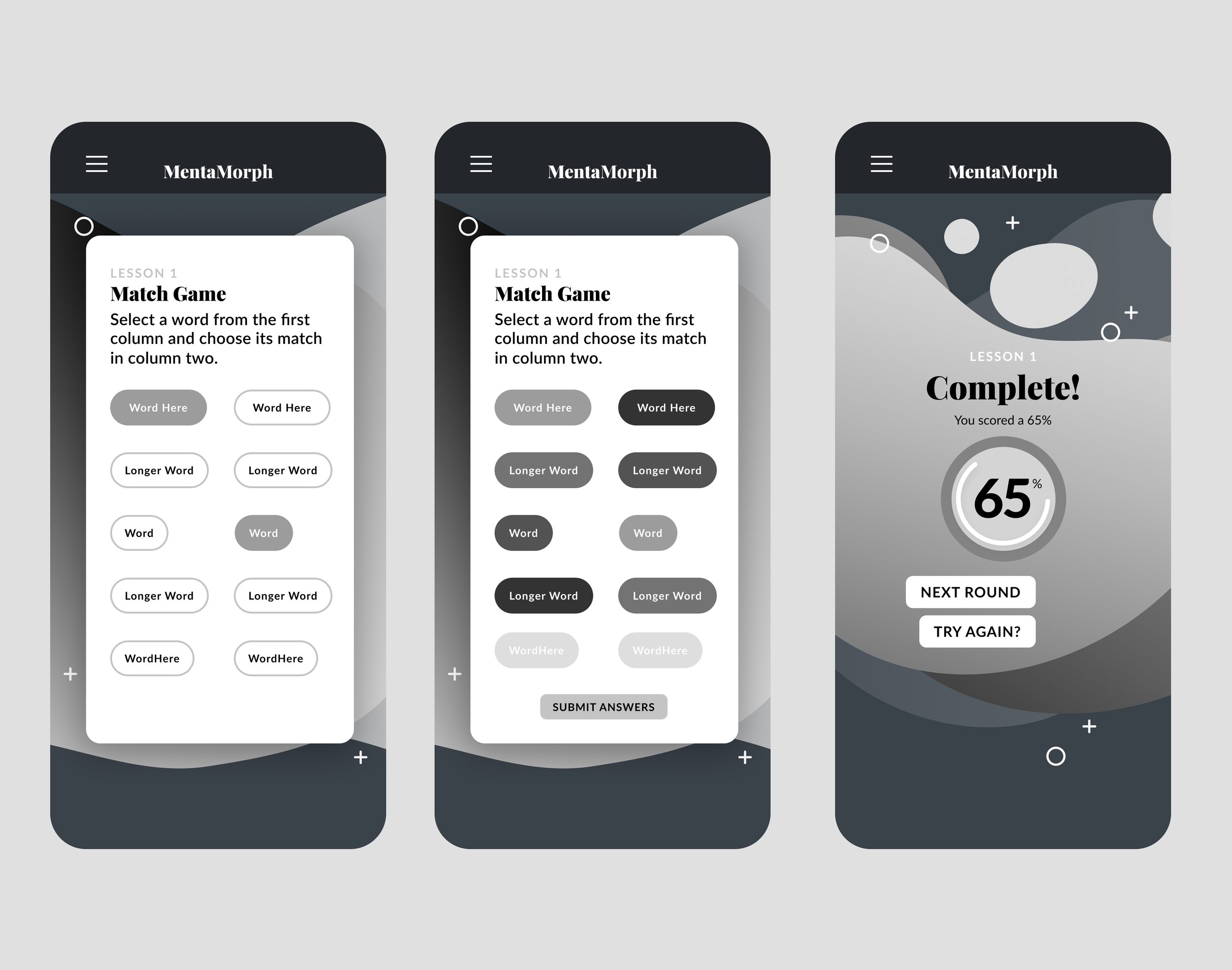
We did an in-depth competitive and comparative analysis of the financial, gaming, and educational app spaces, carefully looking for overlap between the three arenas. We came to our final list of comparators, including games like Sim City, Oregon Trail, and Hobo Capitalist. For our knowledge checks, we looked at successful quiz apps like Duolingo. We wanted our onboarding experience for MentaMorph to get back to basics, so our audience didn’t quit the app. Our target users use apps like TikTok frequently and have little time for long tutorials.

Our competitive and comparative analysis led us to look at both traditional games and finance-oriented experiences.
PERSONA

Our new user Persona: Meet Naomi! She wants to learn about finance in a way that is not too boring.
THE PROBLEM
We began by asking “How Might We?” in various ways to structure our thoughts. This led to our problem statement:
MentaMorph’s users need a way to understand financial concepts so that they can apply their learnings within the game.
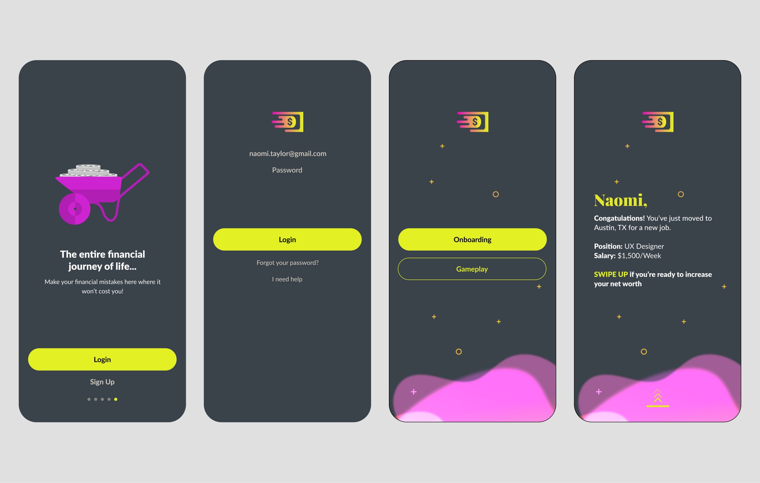
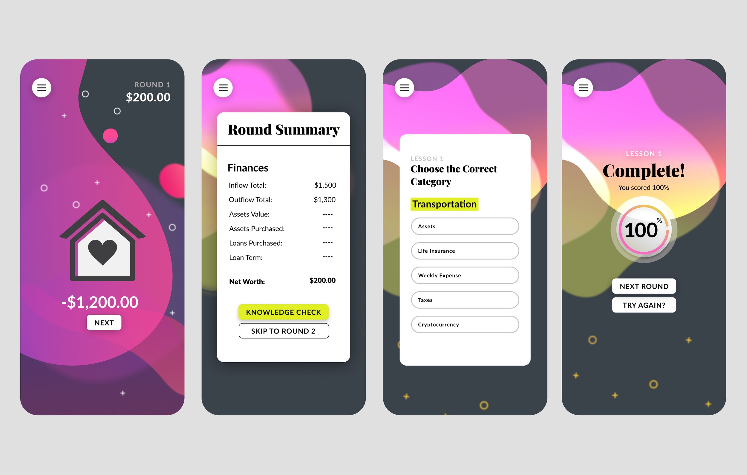
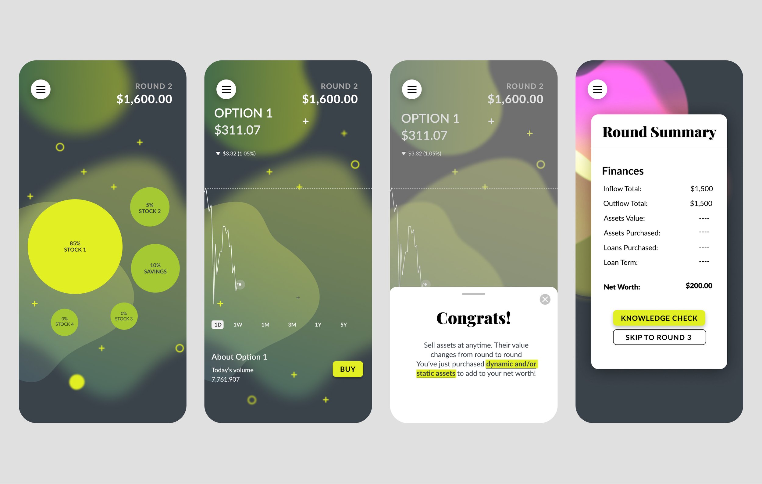
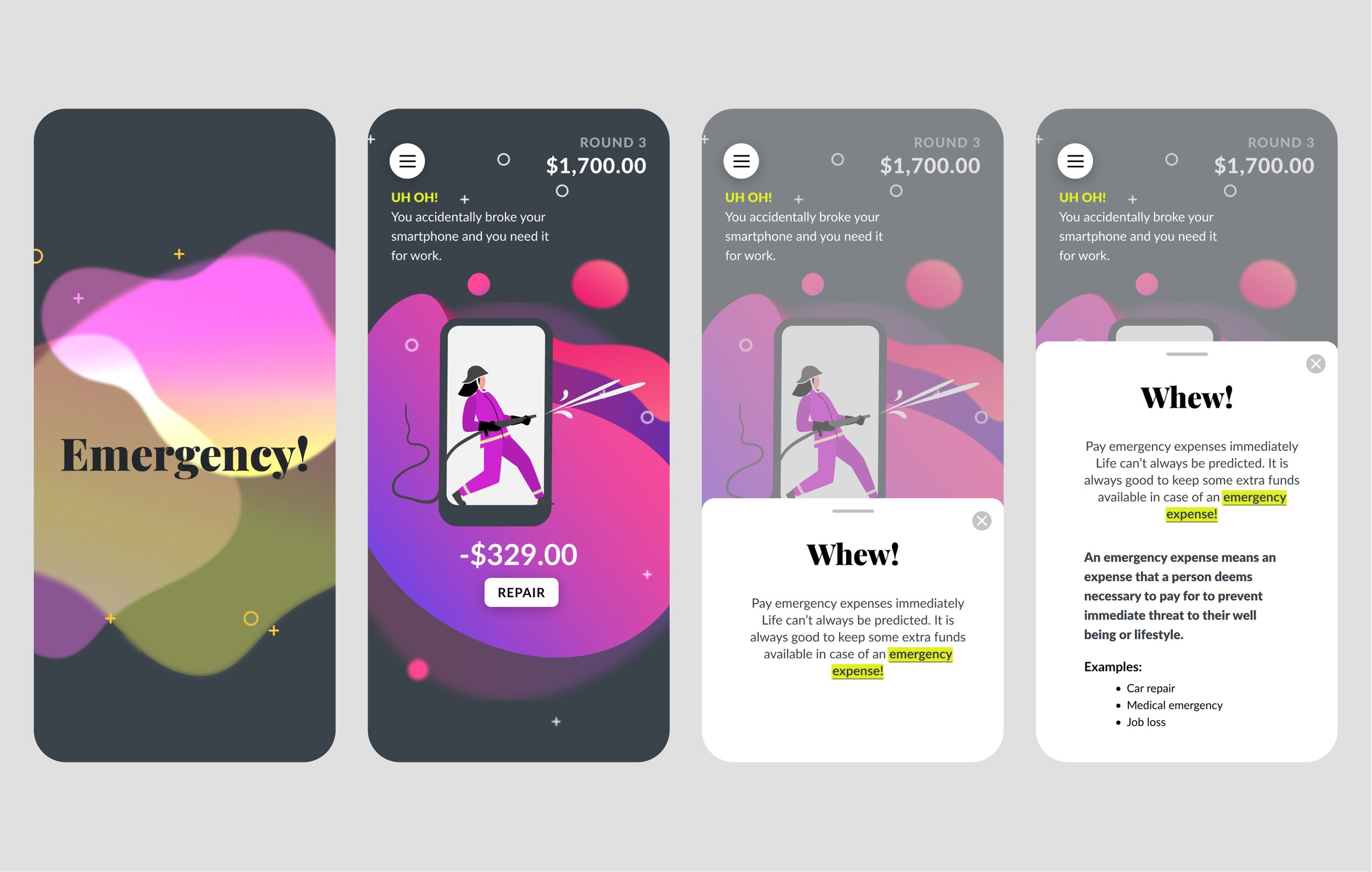
The problem statement and research led us to create a targeted user persona and a simplified user flow that would be based on 4 rounds (instead of 20) and feature a similar structure that would end with a knowledge check.

The reworked User Flow shown above is 1 round of 4 and would be a much more streamlined experienced for Onboarding.
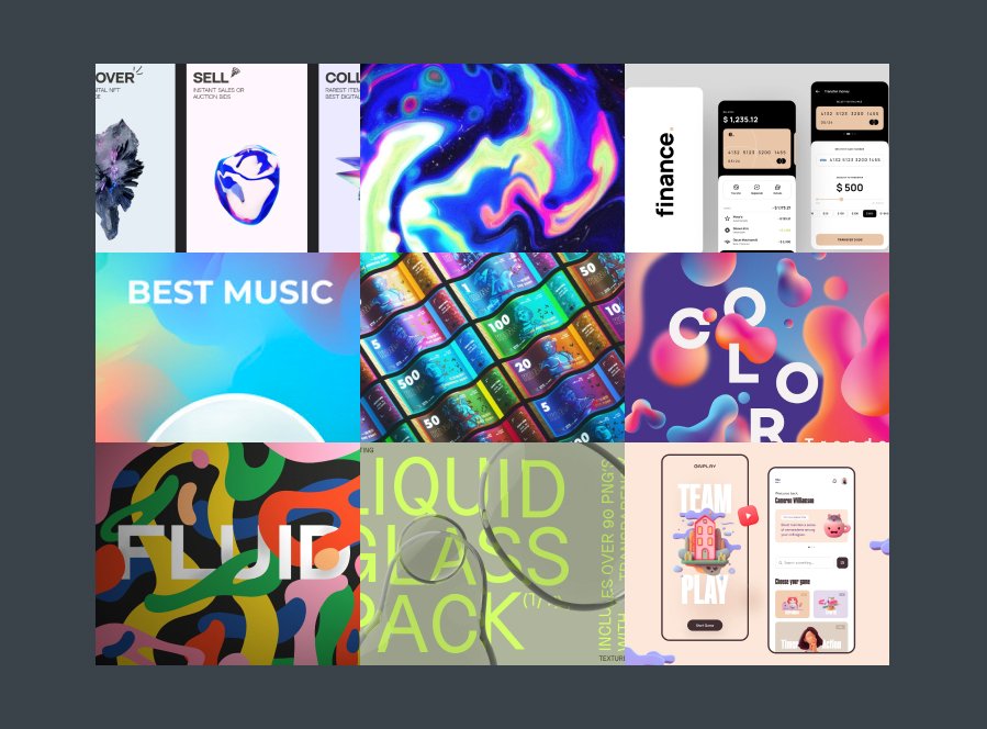
Our look and feel research led us to create a mood board with a more sophisticated palette. This new palette would reflect the recurrent theme of the game: money in and money out. We did competitive research based on our user groups age range (what apps they use the most, what they look like, how they function) before forging ahead with a glassmorphism theme.
DESIGN ITERATIONS
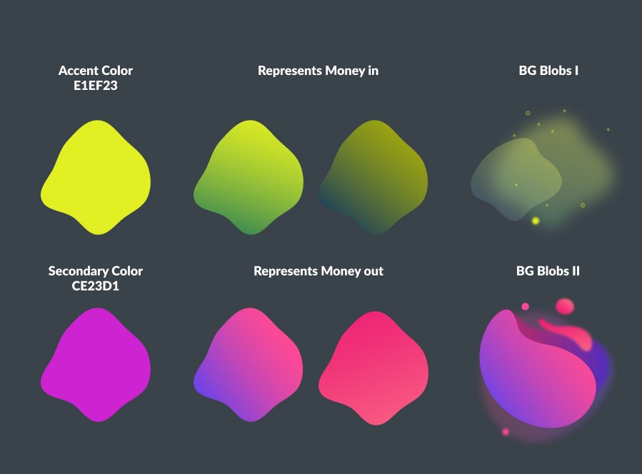
Our mood board featured a more sophisticated color scheme and a rethought overall visual theme. We wanted the colors to reflect the content, so we chose green for money inflow and pink/red to symbolize money flowing out.
We were surprisingly aligned in many of our sketches, even at an early stage. Our biggest challenge became how to integrate the “dictionary” definitions of financial terms while learning how to actually play the future game.
Before going digital, I looked into other educational apps and competitors to draw inspiration for the design. I started with hand sketching and then moved into Figma to create high-fidelity wireframes of key screens.

Our first round of sketches for the project. I was searching for a way to make the current tutorial mode simpler and more engaging.

From sketch to high fidelity prototype. It was great to see one of my original sketches made it all the way through the process.

The home screen transformation from the original file.
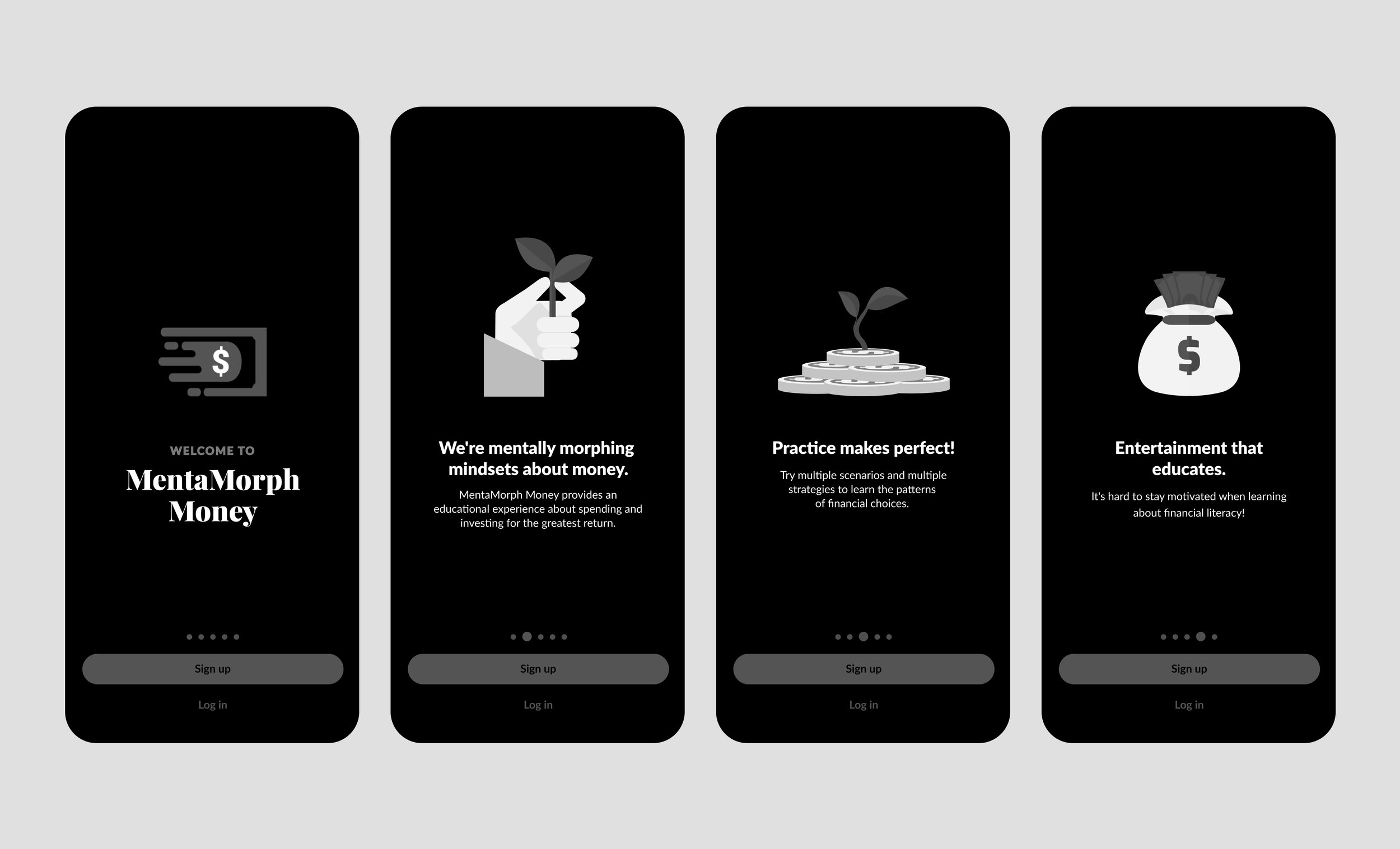
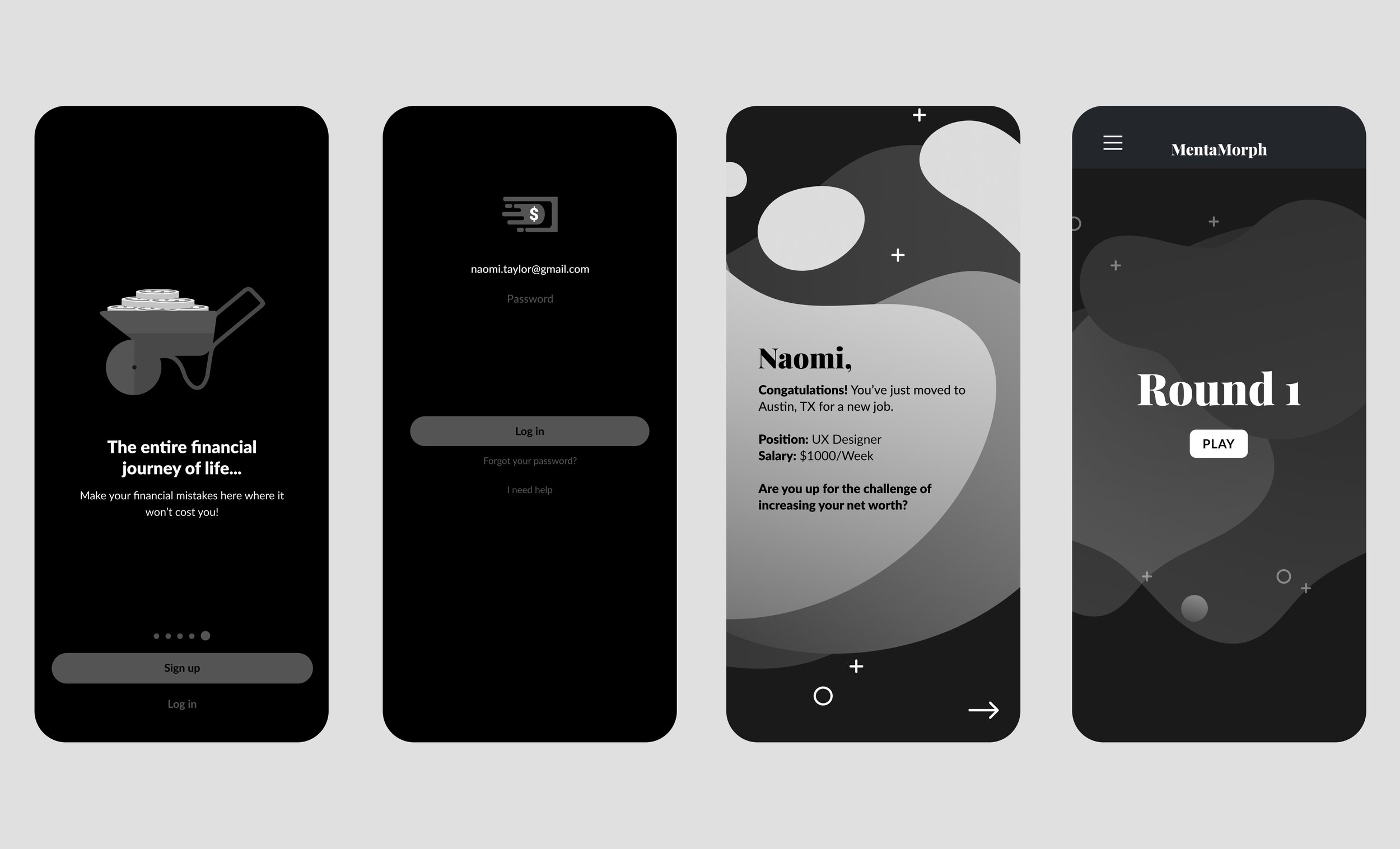
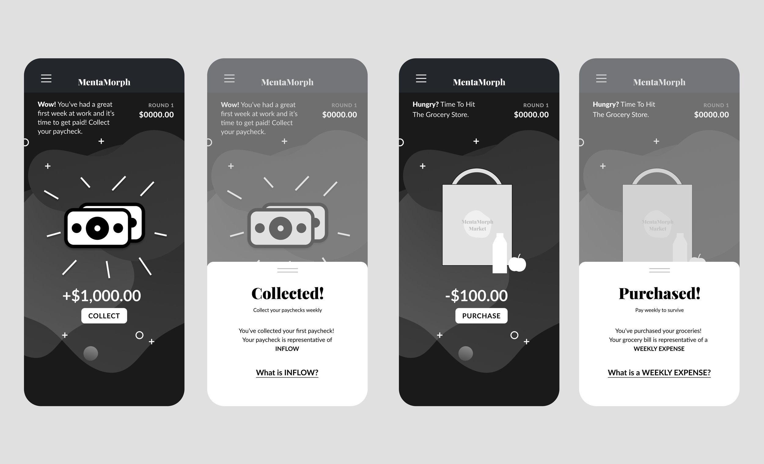
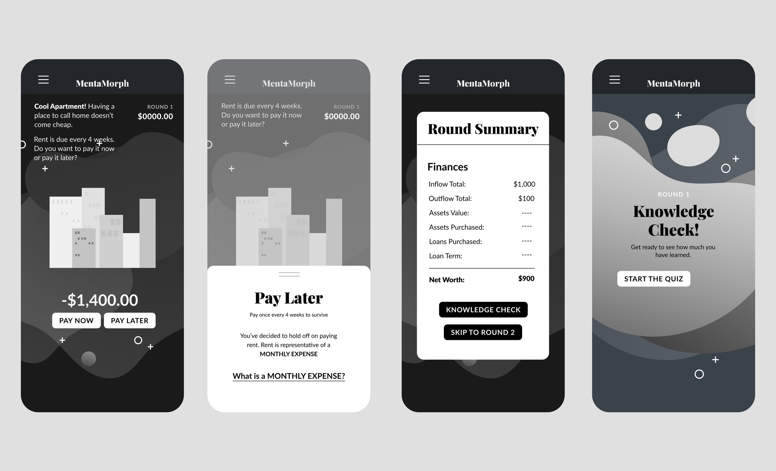
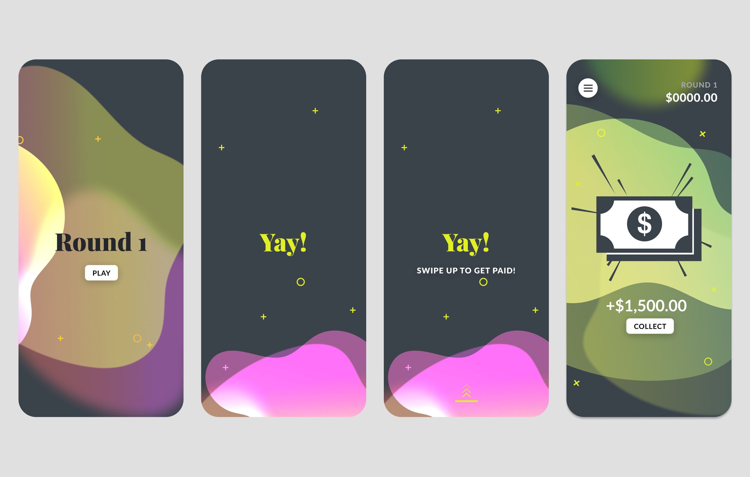
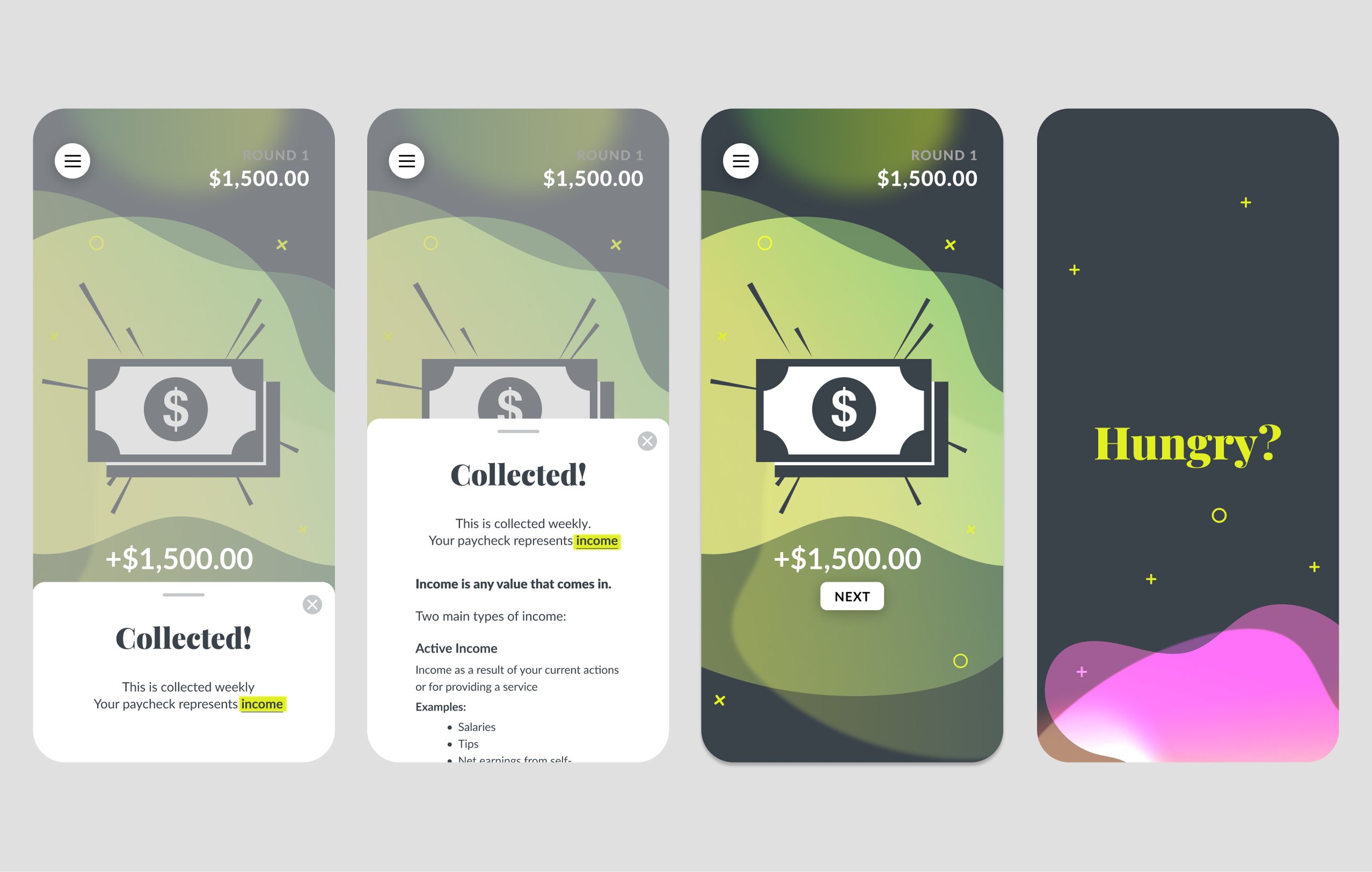
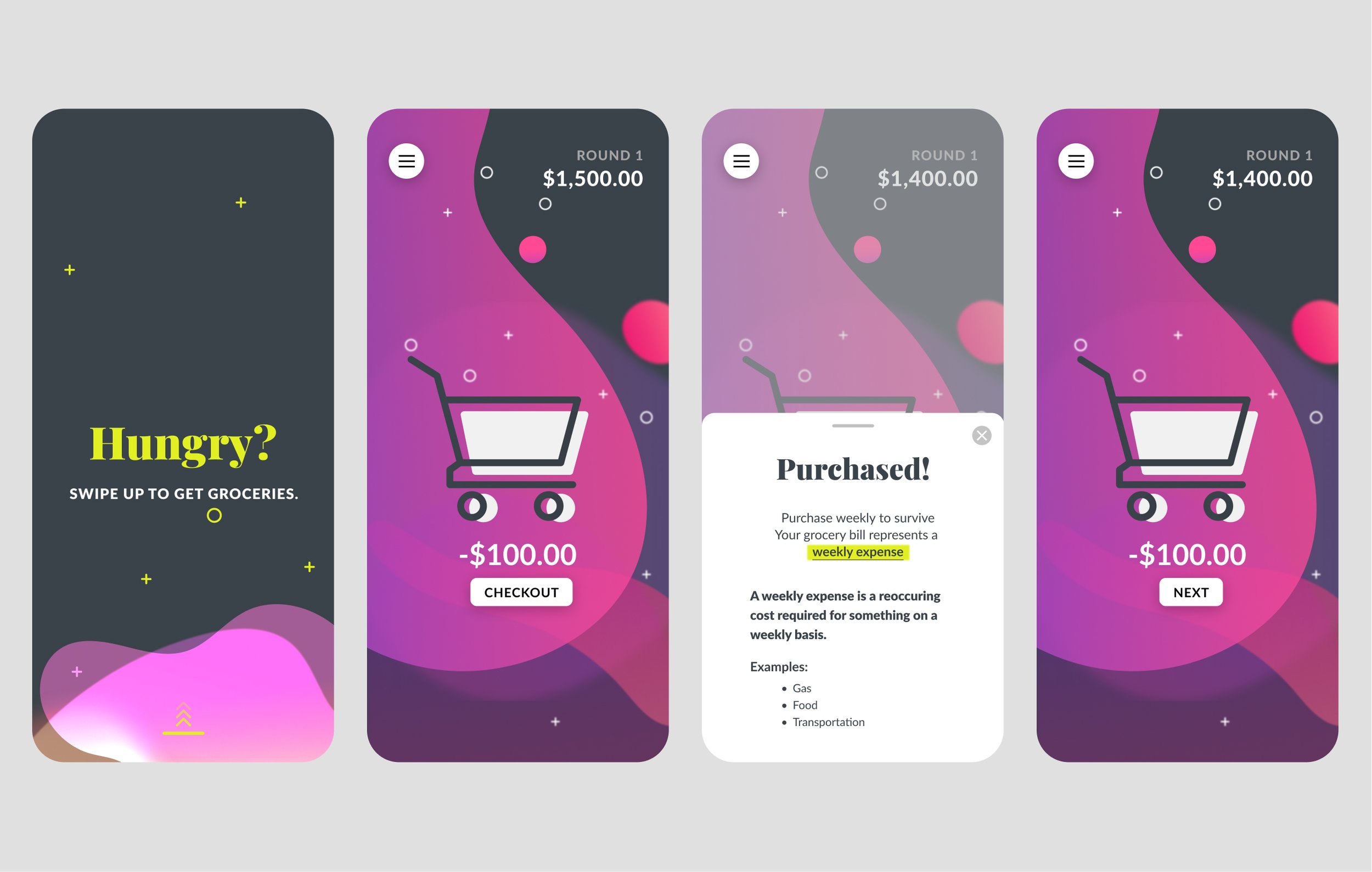
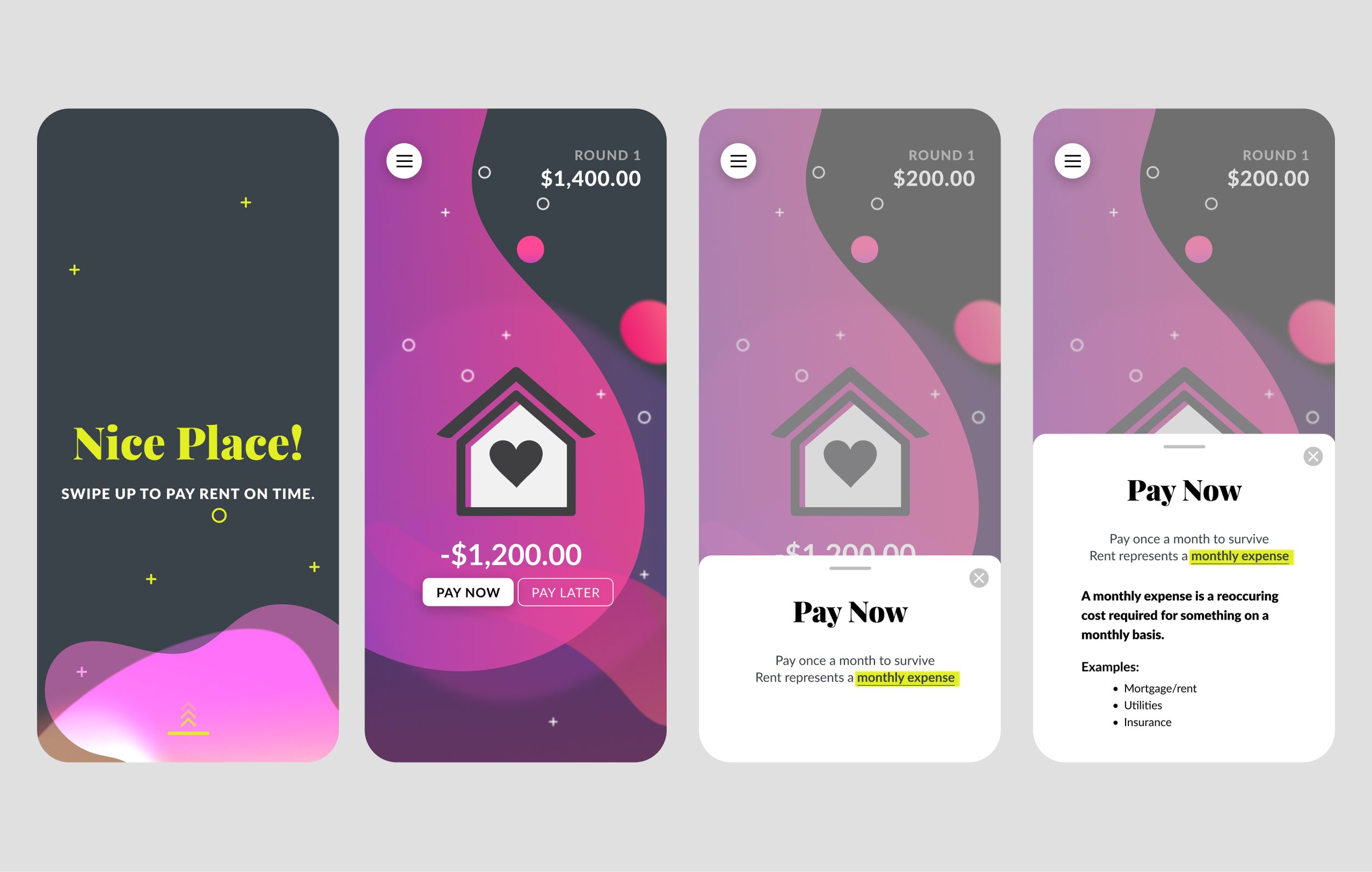
Round 1 of the redesigned Onboarding experience. We introduced popups that would allow the user to learn more about financial concepts if they chose to do so. This streamlined the experience significantly.
TESTING & LEARNING
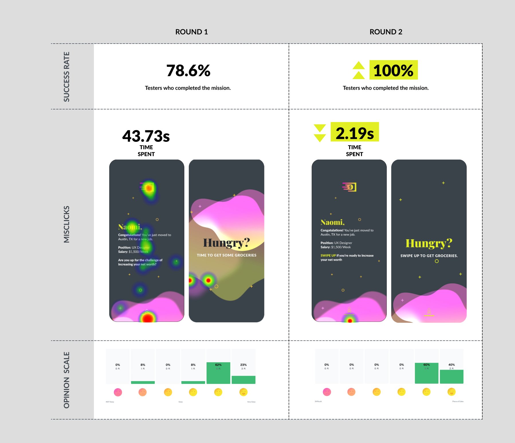
Our reimagined onboarding experience had a completion rate of 100%.
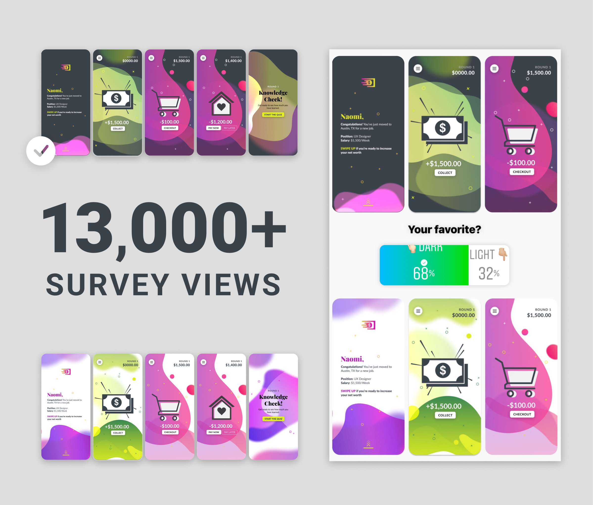
We tested our prototypes using Maze. Our first round test had a 78.5% completion rate. With adjustments to the prototype based on this testing, our reimagined onboarding experience had a completion rate of 100%. This was a 100% increase in completion rate from the original game tutorial which had a very high dropout rate.